Vector Button
The Vector Button may be associated with any two-state audio or logic object such as a mute button or a logic source. Drag and drop the control you wish to associate from a control panel or the design pane on to the Vector Button.
In addition to parameters within the Properties pane the appearance of the Vector Button can be customized by assigning bitmaps and colours from the Gallery. A 'Wave file' can also be assigned from the Gallery to give an audible indication when the button is 'on'.
Properties
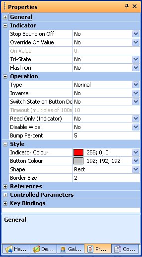
Stop Sound on Off
Turns sound off when in the Off state.
On Value
The value to use when on e.g. muted or un-muted.
Tri-State
Enable this to allow parameters with three values to act as a tri-state on/off.
Flash On
If enabled, flashes the indicator when the parameter is On
Type
The type of button. Normal, momentary, latching or timed.
Inverse
This only affects 'momentary' buttons. When set to 'Yes' the button will be normally 'off' and momentarily comes on when it is pressed. In normal operation it will be normally 'on' and will go off momentarilly when the button is pressed.
Switch State on Button Down
When set to 'Yes', the state of the button changes as soon as the mouse button is pressed down. In normal operation, the state of the button does not change until it is released.
Timeout (multiples of 100ms)
Sets the time between current state and switched state.
Read Only (Indicator)
When set to Yes the button becomes read only and acts as an indicator.
Disable Wipe
When set to Yes, wipe will be disabled.
Bump Percent
The amount to bump up or down as a percentage of the parameter range.
Indicator Colour
Sets the colour of the indicator within the button.
Button Colour
Sets the colour of the button.
Shape
Sets the shape of the button. Circle or square.
Border Size
Sets the size of the border around the indicator.