Text Indicator
![]()
The Text Indicator is a customizable object that can be referenced to any two-state or continuous control.
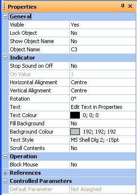
Drag and drop the desired parameter onto the Text Indicator from either the Design Pane or a control panel. When the associated parameter is active the indicator will display the text which has been entered in the properties.
Properties

Stop Sound on Off
Terminates sound when in the Off state.
On Value
Sets the value to be considered as On. For example, if the associated parameter is a mute and this property is set to off, the effect will be that when the mute on the control panel is 'off' then the actual mute will be 'on'.
Horizontal Alignment
Sets the horizontal position of the text within the indicator boundary.
Vertical Alignment
Sets the vertical position of the text within the indicator boundary.
Rotation
Sets the rotation of the text within the indicator boundary.
Text
Sets the text to be displayed when the associated parameter is active.
Text Colour
Sets the text colour.
Fill Background
Sets background fill on or off.
Background Colour
Sets the colour of the background when fill is on.
Text Style
Sets the font style for the text.
Scroll Contents
When set to 'Yes' the text contents of the indicator will scroll within the indicator box.
Block Mouse
When set to 'Yes' will block the mouse messages from passing through the indicator when the indicator is on.