BLU-10 Programming and Operation
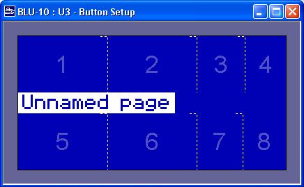
The BLU-10 is a touch screen controller with 8 configurable
zones, these can display from 1 to 8 assignable "buttons."
When using fewer buttons, the remaining buttons can be
wider.
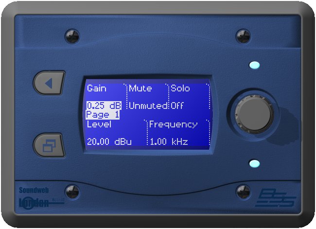
There are two hard keys and a rotary encoder. The top key, the "Exit" key, is effectively a 'Cancel Navigation' key, cancelling the current dialog and routing the user back to the previously displayed page. It also acts as a locate key when double pressed. The bottom key is the 'Page' key. This lets you navigate to a new page by displaying a tree of all available pages for quick navigation. The rotary encoder is used to change the value of the selected control. Security passwords can be assigned to any folder or page to create secure access levels for basic and qualified users.
Setting BLU-10 Parameters
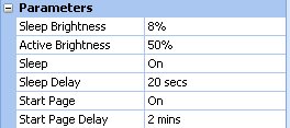
The behaviour of the BLU-10 can be set up in Parameters
Sleep Brightness
Sets how bright the display will be when the BLU-10 is in "sleep" mode.Active brightness
Sets the brightness when the BLU-10 is in use.
Sleep
Can be set to be On or Off. When set to Off, the Sleep Delay has no effect.
Sleep Delay
Sets how long the BLU-10 can be inactive before it enters sleep mode. This only occurs if sleep is set to On.
Start Page
Can be set to On or Off. When set to Off, the Start Page Delay has no effect.
Start Page Delay
Sets how long the BLU-10 can be inactive before it jumps back to the start page. This only occurs if the Start Page has been set to On.
Programming the BLU-10
To open the BLU-10 programming interface either use the
BLU-10 Button Setup in the Device menu or double click
the BLU-10 icon in the layout. The resultant page shows
the blue screen of the controller with the default 'Unnamed
page' name for this menu. A series of pages and sub pages
can be created for a selection of operations.
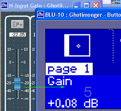
Use the Design tree to locate control panel objects, Presets and other settings and drag them onto one of the touch button zones in the display. The control's name and current setting will be written into the box. Touch zone text can be changed in the Properties and two lines of text input per zone are available. The boxes that define the touch areas can also be resized to show longer words by clicking and dragging on the line.
Controls can be dragged from the design tree...
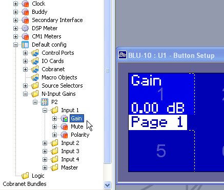
...or from a panel.
Setting Button Properties
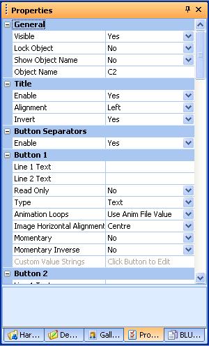
Line 1 Text, Line 2 Text
Put text on a button to replace the default text.
If either of these fields contain text, that text will be displayed and the default text will be hidden. To restore the original, delete both these fields.
Note that the text will not display if a bitmap overlays that area.
Read Only
Set to "Read Only" to prevent any changes to the control on this button. Some controls such as meters are read only by nature and therefore can not be changed even if the button is not read only. However, in order to display a value without allowing any changes to be made to it, set the button to "Read Only".
Type
Selects the type of button required. The options are:
- Text - values will be shown in text. Select this for slow changing values such as a mute or a gain.
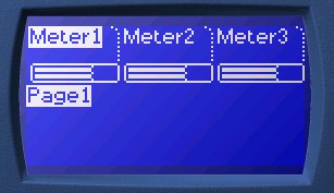
- Meter is optimised to draw quickly, select this type to show meters. If the parameter being represented is a meter such as a BLU-80 meter processing object, it will also be drawn with a peak level. Meter type can also be used to represent other parameters such as toggle values e.g. a mute. This gives a simple graphical representation of the parameter. The meter which is currently selected on the BLU-10 is shown with the text inverted. In this image Meter1 is currently selected.
- Static Image simply draws a bitmap onto the button. These can only be placed on buttons which do not show a value - such as page change or preset buttons. For the bitmap to display the following three conditions must be met:
bitmap dragged onto button from the gallery
valueless control such as page change button dragged onto button
- button type set to Static Image
- Animation type has two functions. The simplest use is to drag a moving image onto the button. This only makes sense when the button does not show a value - such as a page change or preset button. In this case the animated bitmap represents the page change or preset.
- Value Animation - Any parameter on a BLU-10 can be displayed as an animation. For example a 2 frame animation of a tick box with and without the tick could be used on a mute button to give a visual representation of muted and unmuted. Animations in the form of Animated GIFs can be added to the Gallery via the Gallery Menu. An animation must be at least 2 frames. For parameters with few states, like a mute or logic source, there should be one frame per possible value. For continuous types of controls it’s not practical to have one frame per value, so the range of the parameter is divided by the number of frames. Drop the animated GIF from the gallery on to the button and change the button type in the property to Value Animation. The value animation which is currently selected on the BLU-10 is shown with a vertical bar to the right of the image. In this image Button1 is currently selected.
INSERT IMAGE HERE
Animation Loops
This property is only valid with Type set to Animation. Set this to specify how many times the animation will loop before stopping on the last image in the sequence.
Choose from:
- Use Anim File Value - Animations in LA store the number of animation loops which is set in the GIF file from which they are loaded. This option specifies that the GIF value is used.
- Infinite - The animation will loop while that page is shown.
- 1..32 - Select a value between 1 and 32 times.
Image Horizontal Alignment
A static image or animation can be justified Left, Centre or Right in the button.
Momentary
A simple toggle button can be set to be configured as a momentary button by setting the property to Yes. This would be used for example when connecting a mute control to be used for a paging switch. A feature of momentary buttons is that the button does not become released until the touch screen is released. So if the user presses a momentary button but then slides off of it, as may happen during a long paging message, the button stays active. Normal toggle buttons do not toggle unless the press and release are both on the button.Momentary Invert
The polarity of the mute button can be inverted by setting the Momentary Invert property to Yes.Custom Value Strings
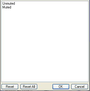
Any parameter displayed on a BLU-10 button which is displayed as a button or a list can have the strings associated with a value changed. So, for example, you can change the strings displayed on the BLU-10 for a mute button from displaying 'Unmuted' and 'Muted' to be say, 'Mutes off' and 'Mutes on' or whatever else you decide.. The Custom Value Strings property is enabled when a parameter is assigned to that button. Click the property to bring up a list box that shows the current value strings. Double-click an entry to change it. Custom Value Strings won’t work for preset buttons.
Using the BLU-10
Hierarchy
Buttons are stored on pages which are stored in folders.Up to 8 buttons can be stored on each page.
There are 2 ways to navigate between pages: Navigation Keys and Page Change buttons.
- Navigation - Navigate through the folders and pages either by using the hard navigation keys or by use of the touch screen. The hard navigation keys are the two real buttons on the front of the BLU-10. The top key is called the Exit key, and the bottom one is called the Page key.
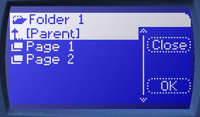
To navigate to another page, press the Page key. The contents of the current folder will be displayed.
Select another page in this folder or select another folder using the Rotary Control followed by the Page key. Alternatively, touch the lower half of the touch screen to move the selection down or the upper half to move the selection up, followed by OK.
Pressing the Exit key from the page selection screen will return the BLU-10 to the last page selected.
To open a folder, press either the OK button or the Page key. Opening a folder changes to that folder and the user can select a page in that folder or a further nested folder.
To navigate up the tree, select the Parent folder at the top of the list.
Page Change Buttons
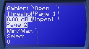
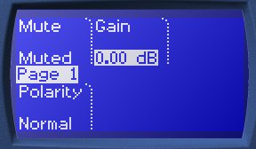
This is a special button on a page which, when selected, causes a jump to another page. Drag a page from the design tree and drop it onto a button. The page must be in the same folder as the current page otherwise all the passwords for all the folders between the two pages would have to be entered.
Passwords
Passwords can be put on folders or pages. They are intended to provide security so that only certain users can control certain parameters.
On Pages
Any page except the Start Page can have a password, which can be numeric or alphanumeric. The password must be entered to open a password protected page. Upon navigating to a password protected page the above dialog is shown.
On Folders
Any folder can have a password, which can be numeric or alphanumeric. The password must be entered to gain access to a password protected folder.
How to set a password
To set a password, go to the BLU-10 Pages pane then right click on the page or folder which requires a password. Select "set page (or folder) password", enter the password style and the password then click on OK. It should be noted that the start page cannot be password protected.
How to enter a password
Highlight the character to enter. The rotary control can be used to move the highlight across the screen. Turn the rotary control clockwise to move the highlight to the right and then down. Turn the rotary control anti-clockwise to move the highlight to the left and then up. Alternatively, the highlight will move to any part of the screen which is touched.
Press the + button to add the character. To insert a space, press the Space button. To change between capital and lower case letters or to show numerals or other symbols, press the Caps button.
When the password is complete, press the OK button.
To correct an incorrectly added character, press the Exit button.
What to do if you forget the password
Send a copy of the configuration file back to BSS for the password to be extracted.
Page Configuration
The look of the BLU-10 display can be customized according to some settings in the BLU-10 page properties.
Button Separators
The button separators are normally shown between buttons as vertical dotted lines with a rounded top.
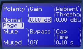
They can be turned off in the BLU-10 page properties.
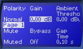
Title
The title normally appears in the centre of a page vertically and on the left horizontally. It can be justified left, centred or right, it can be turned off or inverted. These changes can be made in the BLU-10 page properties.
Button
- Single Big Button - The whole page can act as a single button. Select which button (1-8) to be on the page. This will hide the title. A bitmap can be put in the background.
- Default Button - Set in the BLU-10 page properties, this sets the button that the encoder controls until a different button is selected. If set to a button with a toggle control on it then it will default to the first button which can be controlled by the encoder.
Infrared
Infrared is sent by the Infrared LED and bounced back from a hand in front of the BLU-10 to wake it up.
Bitmaps
A bitmap can be dragged onto a button from the gallery in order to enhance the appearance of the button. Bitmaps can only be placed on buttons which do not show a value - such as page change or preset buttons. The button type must be set to Static Image. Note that the screen size is 128 x 64 pixels.
Animations
Animated (moving) Buttons
Buttons can show a moving bitmap on the button instead of the normal text. To display a moving animation the button must first have had an animation dropped on it from gallery. The button must be a type that does not normally display a value i.e. a page change button or a preset and it must have an underlying control.
Animations can be added to the gallery by importing GIFs which should be black and white only. Animations take their timing from the GIF file. For example a GIF consisting of 5 images may choose to display the final image for a couple of seconds before showing the first 4 again. This can be less distracting than a continually moving image. The number of times to cycle through the animation is normally taken from the GIF file but can be overridden in the button properties.
There is a limit to the number and speed at which the BLU-10 can draw pixels. All pixels of an image are redrawn so a large image that is nearly blank takes as long to draw as a "busy" image. In general, a small section of a image moving looks better than the whole image moving.
Single big buttons cannot show animated bitmaps.
Operating the BLU-10 in London Architect
Once the menu pages have been created, the operation of the BLU-10 pages can be tested using the special simulate mode that shows how the controller will work when in use, thus ensuring the correct menu structures are in place before the system goes live. BLU-10 simulation is activated from the Device menu using the Run BLU-10 simulation command.
Click on the touch zones to select operation of the configured controls and presets.
The two buttons enable navigation through a nested menu structure if multiple pages have been created. The bottom button leads to a menu structure displaying the pages for selection by the rotary, the top button acts as a 'Cancel Navigation' button, cancelling the current dialog and routing the BLU-10 back to the previous selected page.
The simulation can be stopped by right clicking on the virtual BLU-10 and selecting 'End Simulation'.
